-Overview-
An AI health coach that turns body signals into next steps
What
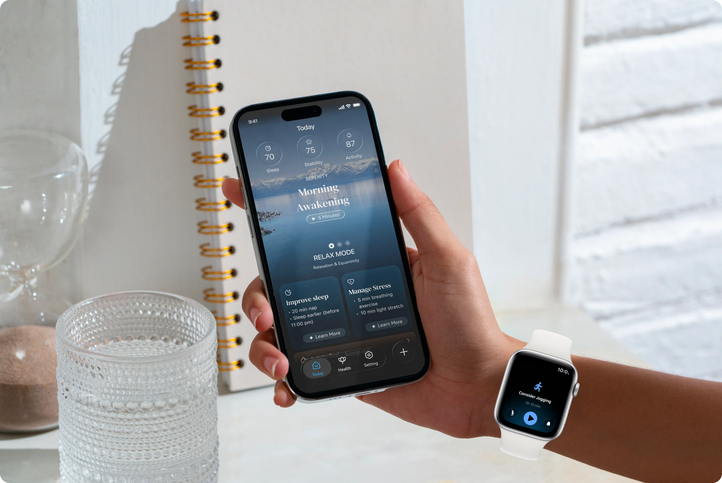
AI-powered health app
Translates body data into understandable insights and guidance.
Who
Mature users, 35–60
Health-aware adults the product team identified as the core audience.
Why
Sense changes, lack guidance
They notice changes in their bodies but don’t know how to interpret or respond.
How
Sense → Interpret → Guide → Adapt
A four-step framework from raw data to adaptive support.
01 — Research
Users don’t need more data. They need to know what it means.
I surveyed 800+ users and ran in-depth interviews with 80+ of them to learn how adults aged 35–60 read health data, react to alerts, and what guidance they expect.
-Research Approach-
Three questions, two methods
Research questions & methods
3 questions · 800+ survey responses · 80+ in-depth interviews
Hide details

Research questions & methods
3 questions · 800+ survey responses · 80+ in-depth interviews
Hide details
Research goals & core questions
Goal 1
Understand everyday health monitoring needs
Q: How do mature adults perceive and use health monitoring data in daily and active scenarios?
Goal 2
Identify gaps between alerts and action
Q: What happens when users receive health alerts but lack clear guidance on next steps?
Goal 3
Define effective health guidance
Q: What balance of explanation, guidance, and long-term context do users expect?
Methods · Real-life health decision moments
Quantitative research
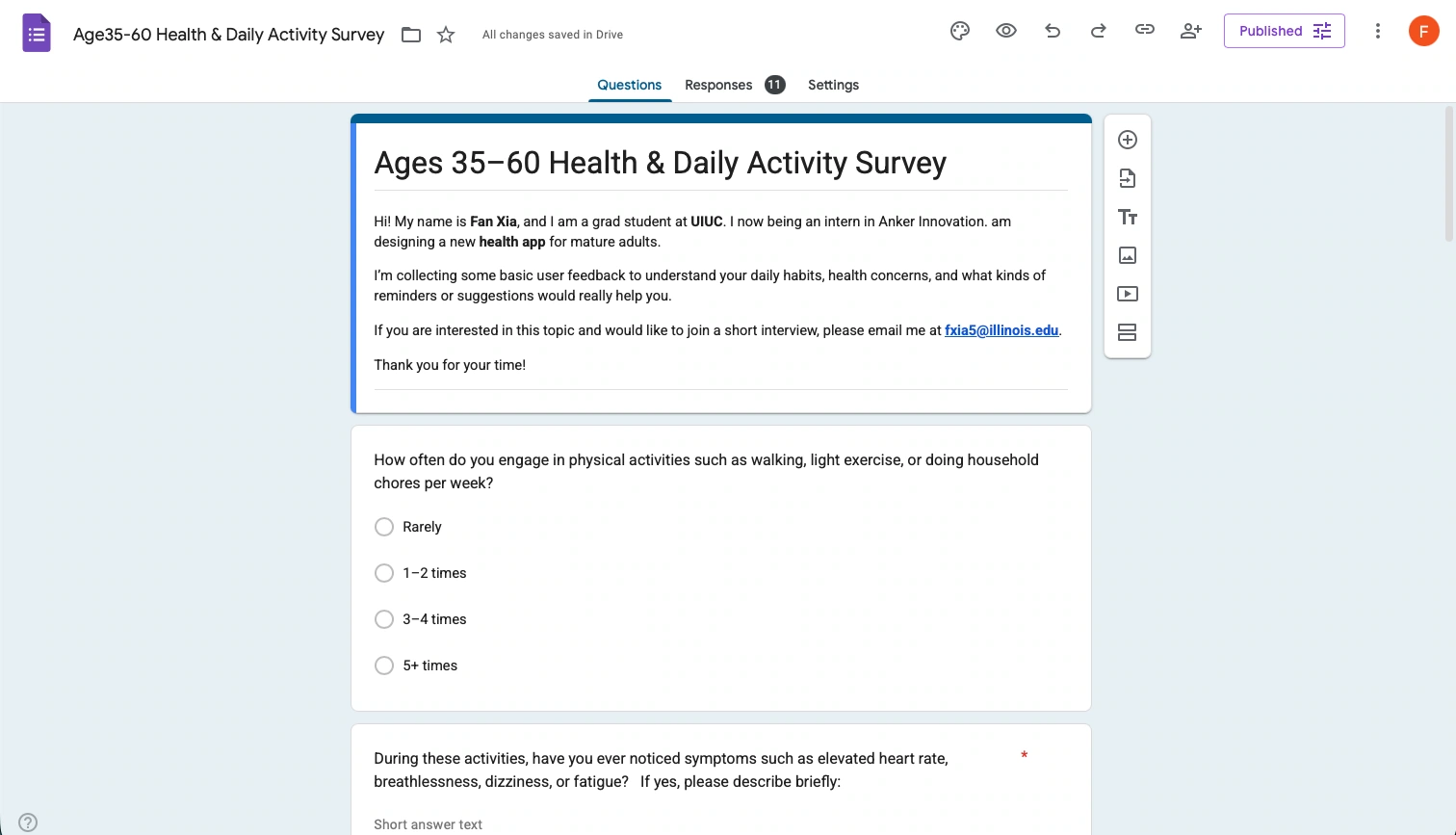
Online survey · 800+ responses, ages 35–60
• Identify common patterns and needs
• Support insights with quantitative data
• Inform scalable design decisions

Qualitative research
In-depth semi-structured interviews · 80+ users
• Uncover barriers in interpreting and acting on alerts
• Clarify expectations around guidance, frequency, and tone
Outcome
Three core design pillars emerged for building the app from the ground up: information architecture, personalized data summaries, and a notification system.
-User Types-
Three ways of relating to health data
Usage habits and expectations split users into three types. Each type later gets its own alert tone, data depth and guidance style.

Type 1
Health Maintainer
Leslie, 57
“Health-conscious, but hates feeling over-monitored.”
Simple language
Clear trends
Few alerts

Type 2
Trend Seeker
Claudia
“Wants reliable insights that keep her in control, without overload.”
Trend summaries
Personal tips
High-signal alerts

Type 3
Health Manager
Bob
“Relies on precise, continuous data to manage cardiovascular risk.”
Cross-metric insight
Predictive signals
Clinical clarity
Persona details
Usage, goals, pain points and core needs for each type
Hide details

Persona details
Usage, goals, pain points and core needs for each type
Hide details
Type 1 · Health Maintainer
Leslie Voge, 57 · Network architect
Usage & behavior
• Intermittent device usage
• Passive health monitoring
• Routine-based activity
• Low notification tolerance
Goals
• Maintain improved health
• Monitor existing conditions
• Natural health maintenance (diet, walking)
• Simple trend summaries
Pain points
• Apple Health feels too complex
• Hates “junk reminders” (e.g., Stand notifications)
• Does not understand or trust advanced metrics
Core needs
Simple language
Trustworthy summaries
Clear trend direction
Minimal, meaningful alerts
Type 2 · Trend Seeker
Claudia Villegas
Usage & behavior
• Continuous device usage
• Trend-oriented monitoring
• Phone-first review
• Low notification tolerance
Goals
• Understand long-term health trends
• Improve sleep quality & stability
• See cross-metric relationships
• Feel reassured by data
Pain points
• Apple Health lacks conclusions
• Insights are fragmented
• Alerts are too frequent and vague
• Explanations feel technical and non-actionable
Core needs
Interpreted insights
Personalized recommendations
Clear trend summaries
High-signal feedback
Type 3 · Health Manager
Bob Benson
Usage & behavior
• Continuous, multi-device tracking
• Data-first decision making
• High sensitivity to early risk signals
• Proactive monitoring
Goals
• Detect health risks before symptoms
• Maintain stability without incidents
• Build complete personal health knowledge
• Slow biological aging
Pain points
• Insights are fragmented
• No multi-parameter risk interpretation
• Alerts are reactive, not predictive
• Explanations too shallow for decisions
Core needs
Long-term tracking
Cross-metric synthesis
Predictive risk signals
Clinically grounded explanations
-Key Insights-
Users trust their bodies more than alerts
Survey data
The numbers behind each insight
Hide details

Survey data
The numbers behind each insight
Hide details
Module 1
Health Data & Interpretation

Finding
Insight
Implication
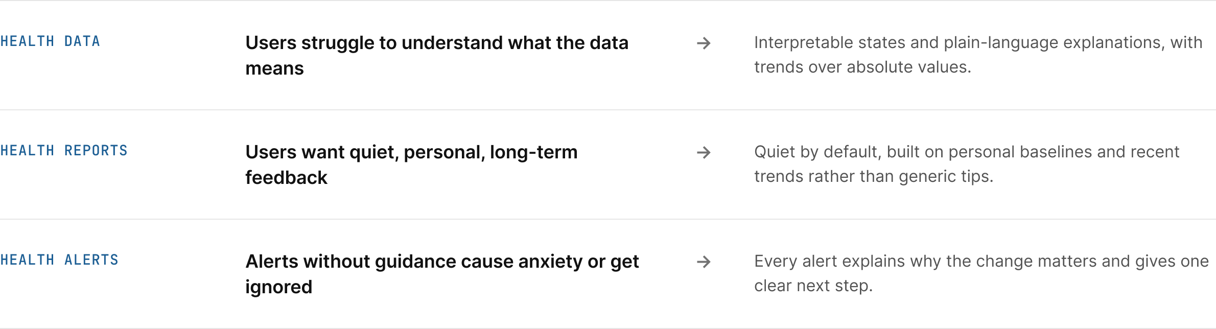
Struggle to understand what it means

Interpretable states and plain-language explanations
Trends and comparisons over absolute values
Trend-first views that emphasize comparison
Signal seriousness , not more data
Risk prioritization and clinical relevance
Module 2
Health Report System

Finding
Insight
Implication
Subtle, controllable feedback over intrusive alerts
Quiet by default , escalates only when necessary
Personalized recommendations , not generic
Individual baselines, recent trends and activity context
Long-term feedback over real-time nudging
Trend summaries and severity-based signals
Module 3
Health Alerts

Finding
Insight
Implication
Users trust their bodies more than alerts
Match bodily perception and explain why a change matters
Users want alerts before crossing danger
Personalized, threshold-based alerts
Without guidance, alerts increase anxiety or ignored
Alerts must include clear, actionable next steps
-Competitive Landscape-
Where existing apps stop short

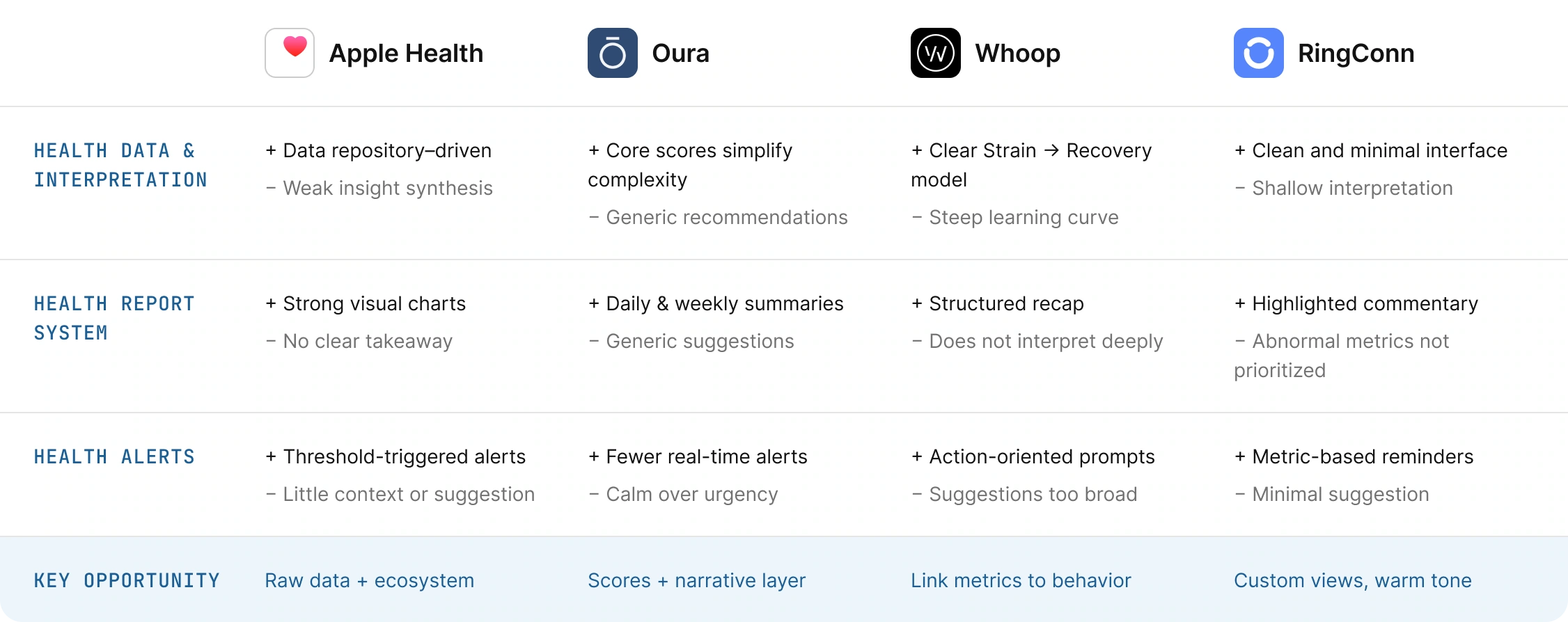
Apple Health
+ Raw data & ecosystem
− Weak synthesis, no takeaway

Oura
+ Core scores, calm tone
− Generic recommendations

Whoop
+ Clear Strain → Recovery model
− Dense, steep learning curve

RingConn
+ Clean, minimal interface
− Shallow interpretation
Opportunity for eufy
Score-first simplicity, a narrative interpretation layer, customizable data depth and calm, prioritized alerts — in one system that connects metrics to behavior change.
Score first
Interpretation layer
Custom data depth
Calm alerts
Competitor analysis
Apple Health · Oura · Whoop · RingConn
Hide details

Competitor analysis
Apple Health · Oura · Whoop · RingConn
Hide details
02 — Design
From data review to state-aware guidance
Research pointed to three design pillars: a layered information architecture, personalized interpretation, and a tiered notification system.
-Information Architecture-
Interpretation before detail
Alerts appear only for meaningful changes, core scores summarize the day, and detail is revealed progressively.
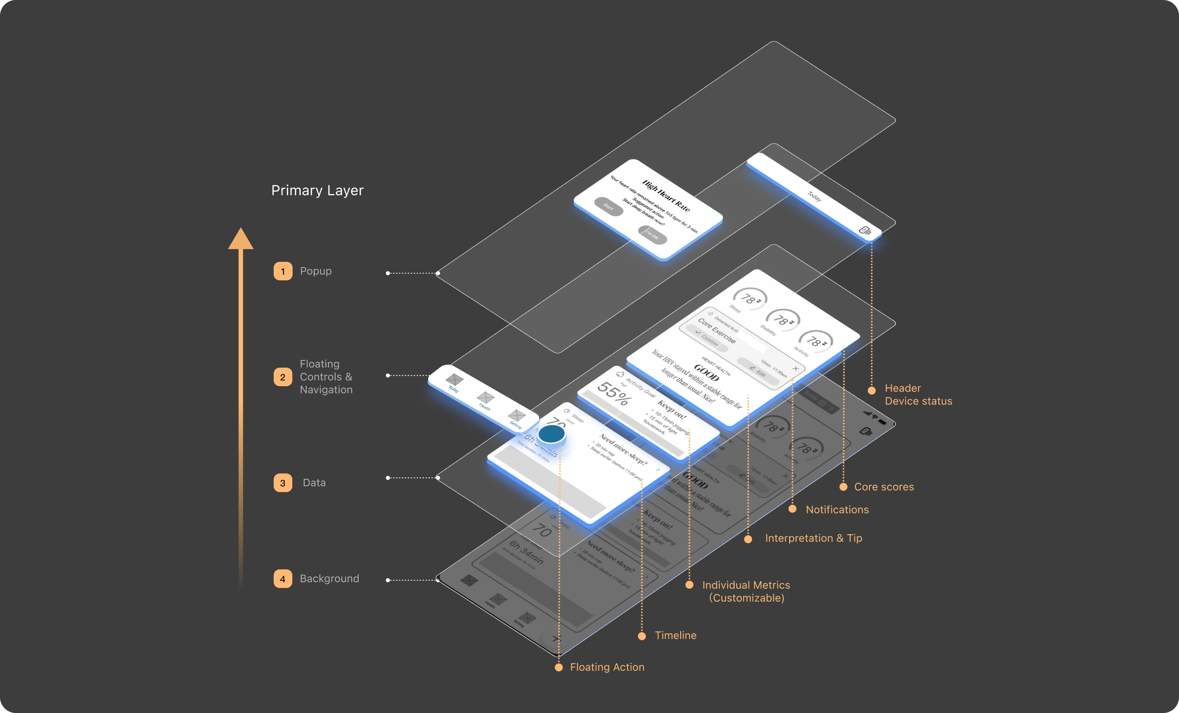
01
Selective alerts
Pop-ups and floating cards fire only on significant trend deviations.
02
Core health index
Raw signals become states: Recovery, Stability, Risk.
03
Interpretation
Explains changes, surfaces anomalies, gives personal guidance.
04
Progressive disclosure
Summary on top, detail in the middle, personal data at the bottom.
-Core Pages-
Score → Meaning → Action
The home page shifts from showing data to helping users understand their state and act on it. Visual density increases gradually as users scroll.
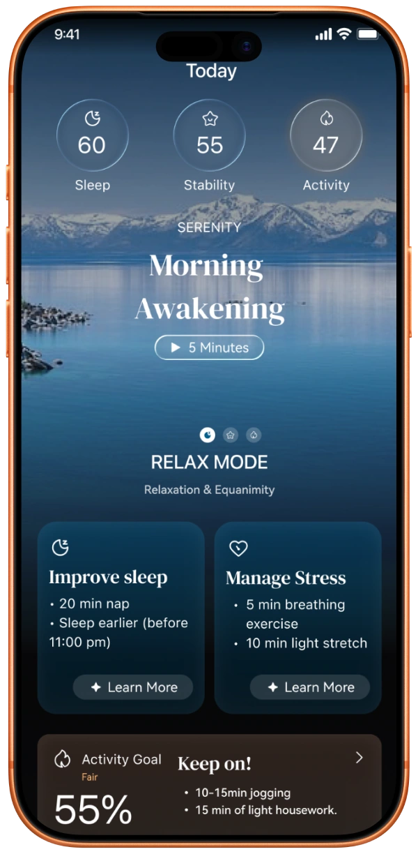
Today
Daily overview
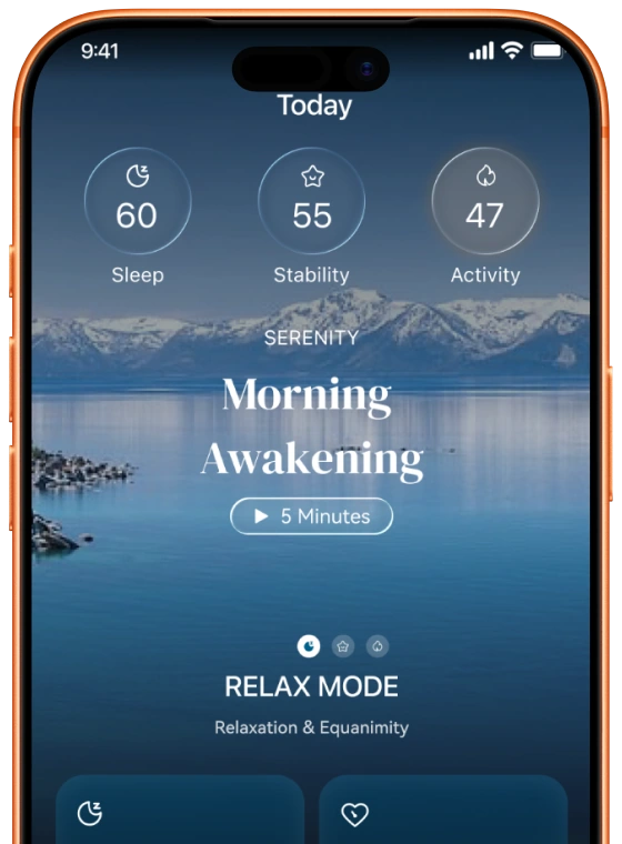
Three core scores, one daily theme, and action cards with specific, time-bound steps.
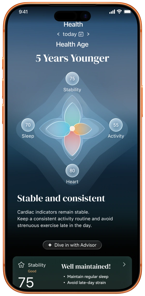
Health
Health Age
Aggregates key metrics into one comparison against chronological age; the flower graphic shows what drives it.
Page details
Today modules, Health, Setting and onboarding
Hide details

Page details
Today modules, Health, Setting and onboarding
Hide details
Today · Information framework
From data review to clear, actionable guidance
The homepage shifts from showing data to explaining state and guiding action.




Summary layer
Scores below 50 glow orange and above 85 glow blue for instant status.
Core daily theme
Turns data into one clear direction for the day.
Action cards
A framed issue with time-bound actions, e.g. a 20-minute nap.
Activity goal
Goal progress with concrete actions to close the gap.
Metric cards
Score, then tip, then chart, so density builds gradually.
Edit card
Users pick, reorder or hide the metrics they see.
Timeline
Connects daily actions to physiological outcomes.
Promotion card
Feature discovery and ecosystem expansion, e.g. Family Plan.
Primary navigation
Today, Health and Setting tabs with native-style ≥44pt buttons.
Reading order
Score → Meaning → Action → Trend validation
Health & Setting · Information framework
Understand the body, then control the system
A flower graphic shows Health Age and what drives it.
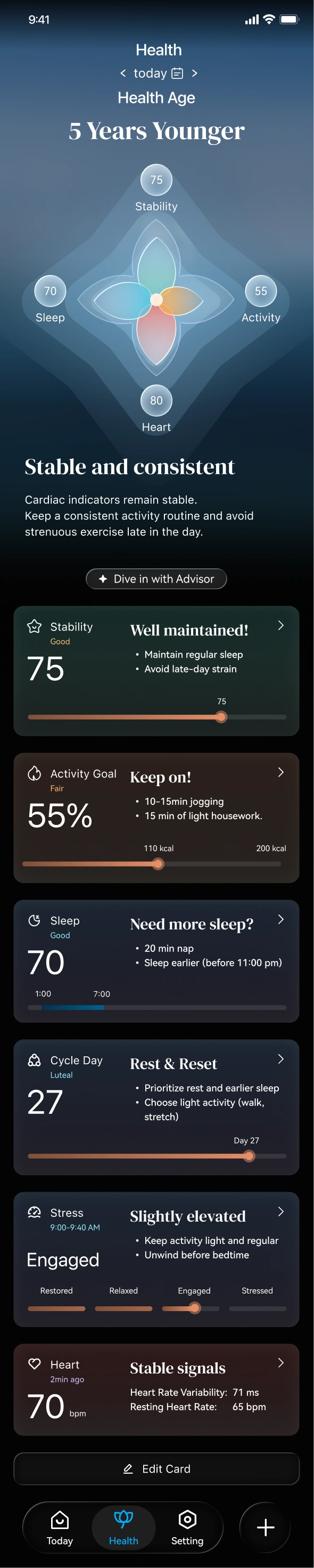

Header & day filter
Switch days to compare changes.
Core daily theme
Four dimensions combine into one score; any below 50 glows orange.
Interpretation
A warm summary with advice and an AI advisor entry.
Action cards
Each card answers What → Why → What should I do.
The control layer for personalization, devices and notifications.
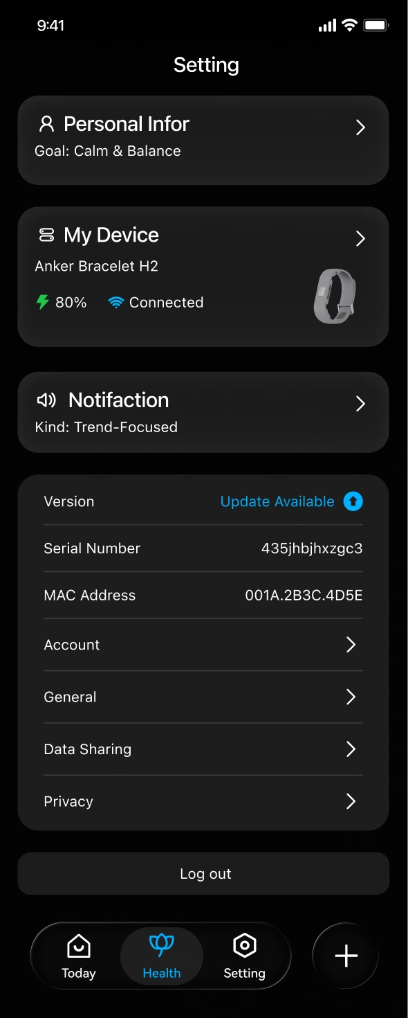

Personal info
Baseline data, goal intensity and interface mode by user type.
Device info
Battery, connection and device details.
Notification
Phone and watch alerts, type and intensity.
Other setting
Account, privacy and version info.
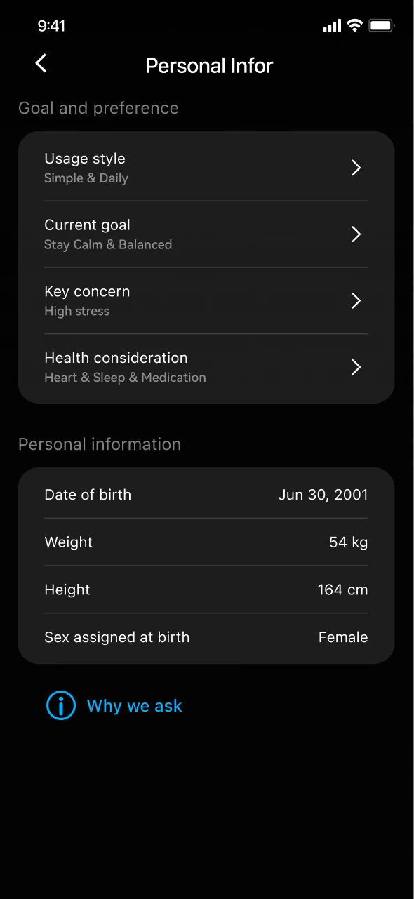
Personal info setting
Baseline data and goal intensity.
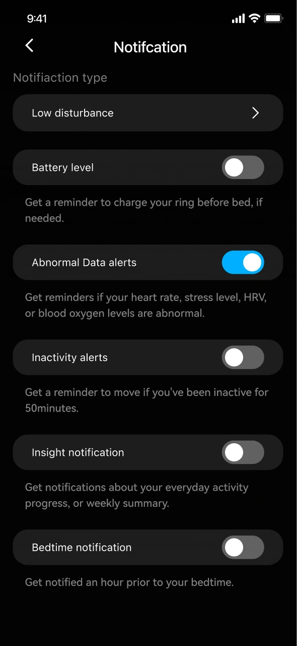
Notification setting
Alert types and intensity.
Onboarding · Personalized data
Lightweight steps that power personalization
A few lightweight steps capture the inputs behind personalization.
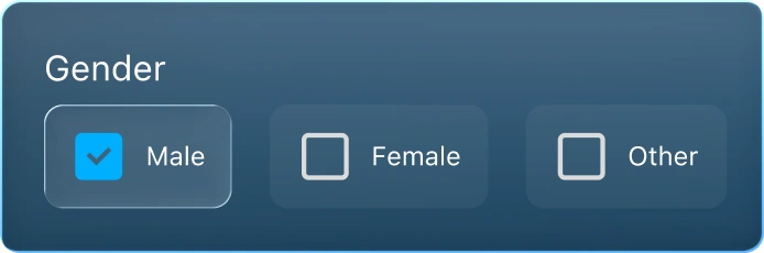
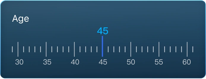
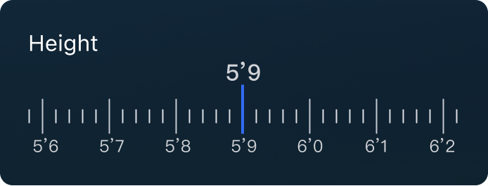
Basic health profile
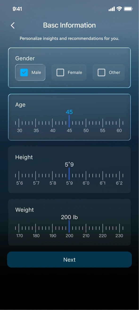
Gender via simple checkboxes.
Age, height and weight via one-swipe scale selectors.
Selected
Unselected
Personal preference
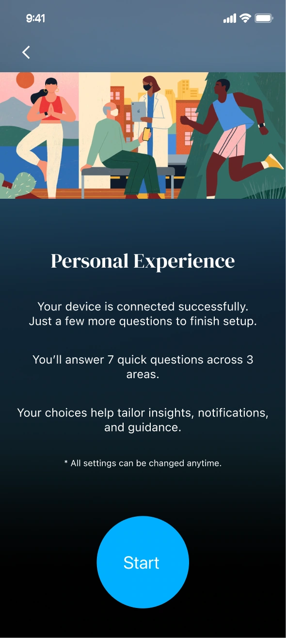
Usage habits sort users into three types that shape alerts.
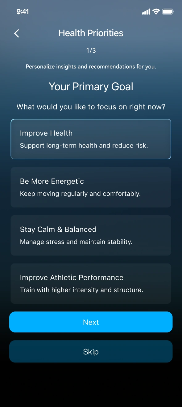
AI advisor settings match advice to each user.
-Adaptive Activity Modes-
Goals that follow the body’s readiness
Based on HRV, heart-rate trends and recovery, the app recommends a daily mode. Goal intensity and tone of voice change with it; users can switch with a swipe.
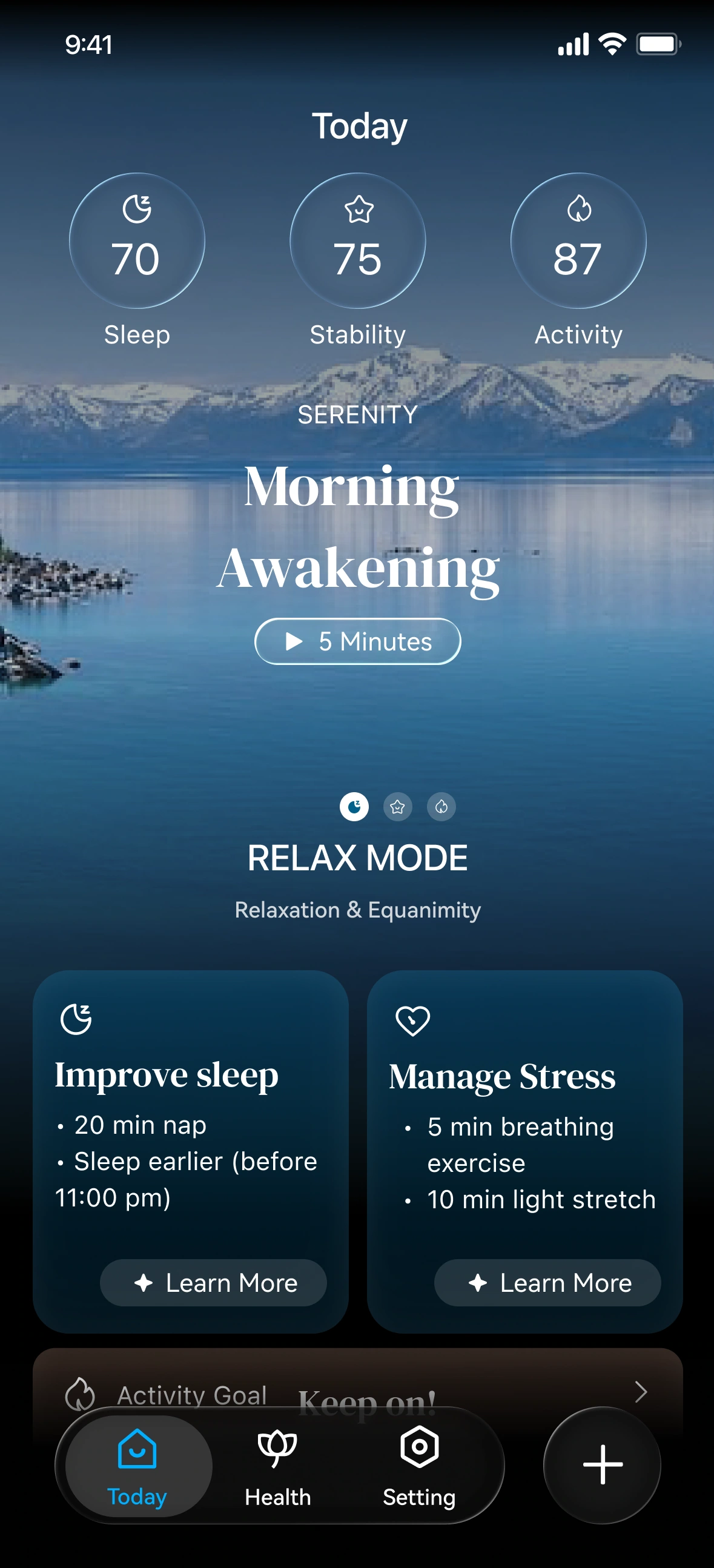
Relax mode
Recovery below baseline
Lower activity goal; calm guidance that avoids pressure.
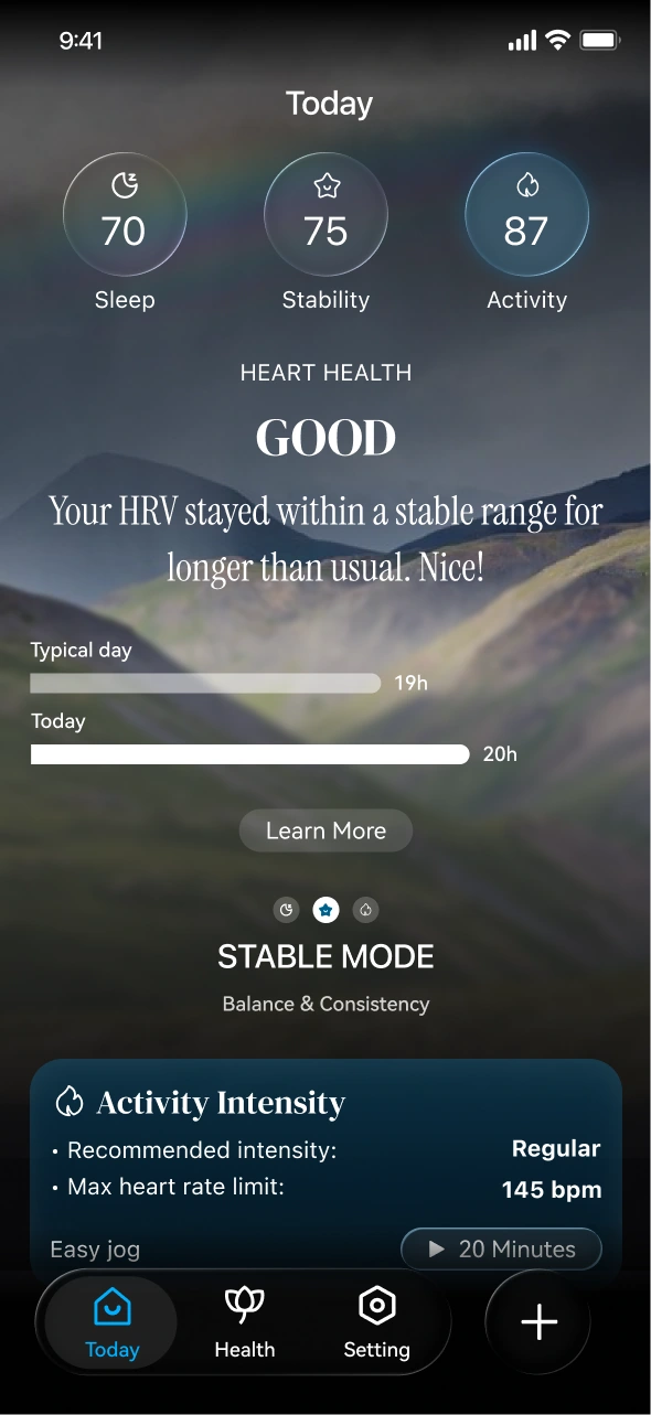
Stable mode
Signals within normal range
Keep the regular rhythm; neutral, supportive tone.
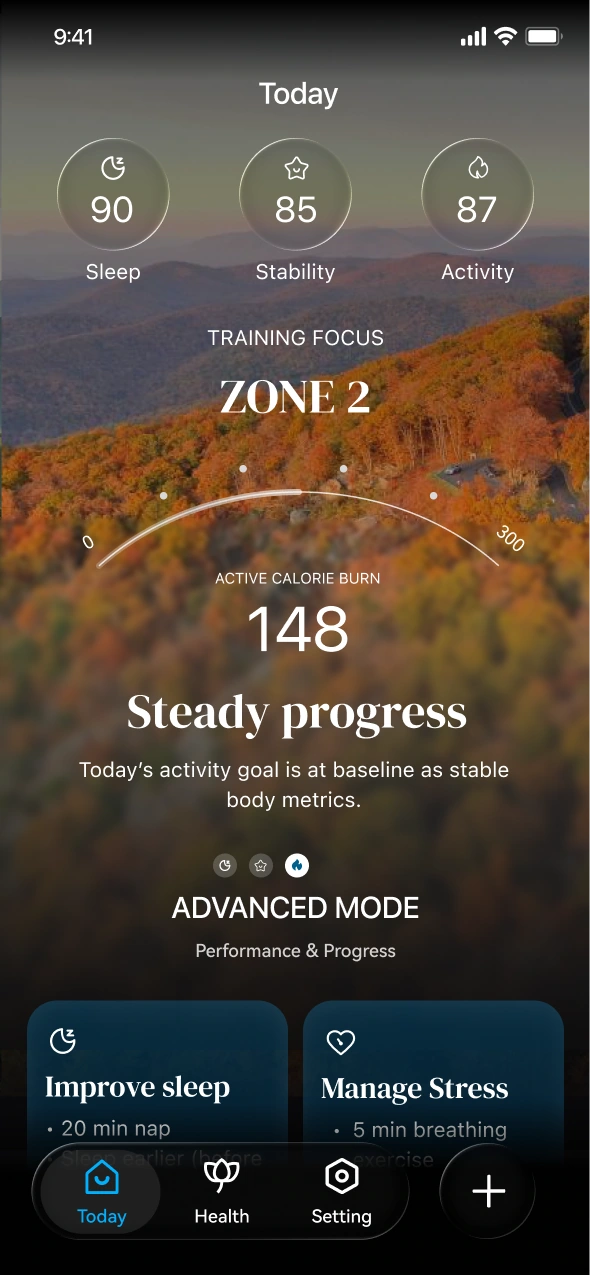
Advance mode
Strong readiness
Encourages harder activity within safe capacity.
-Personalized Jogging-
Same run, three levels of guidance
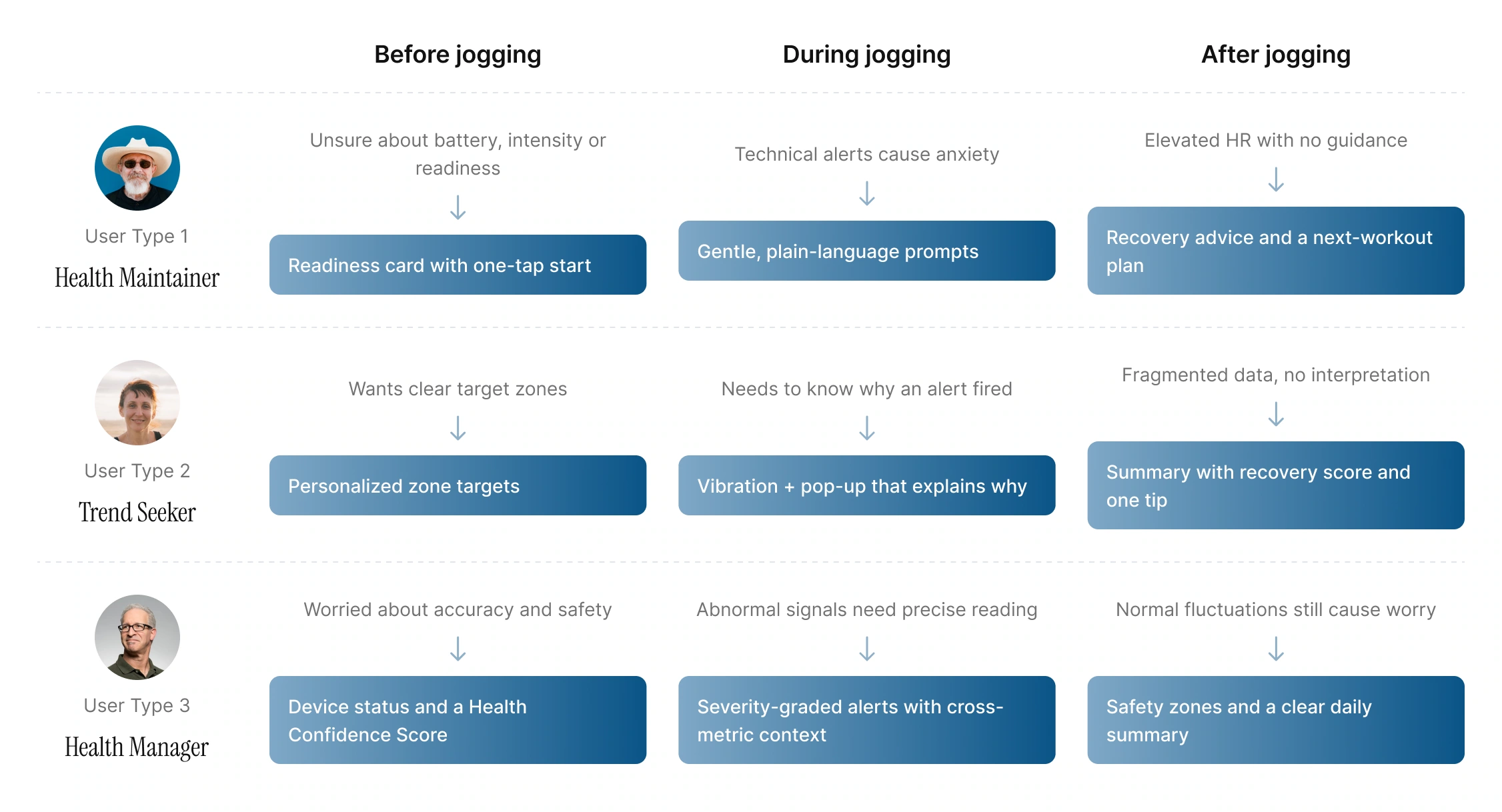
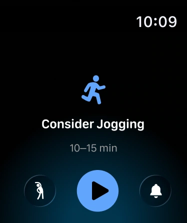
The watch adapts how much it says, and how, to each user type.
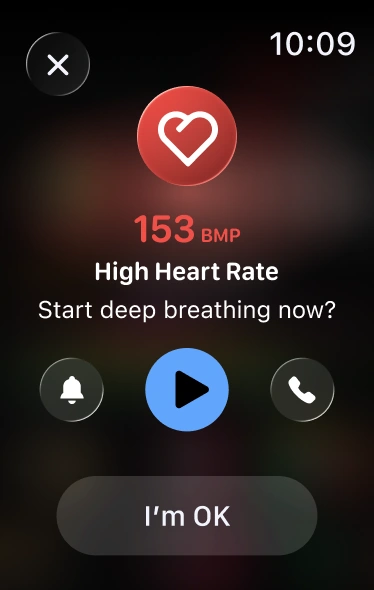
All types
High heart-rate warning
A light vibration and a clear signal the moment HR leaves the target zone.
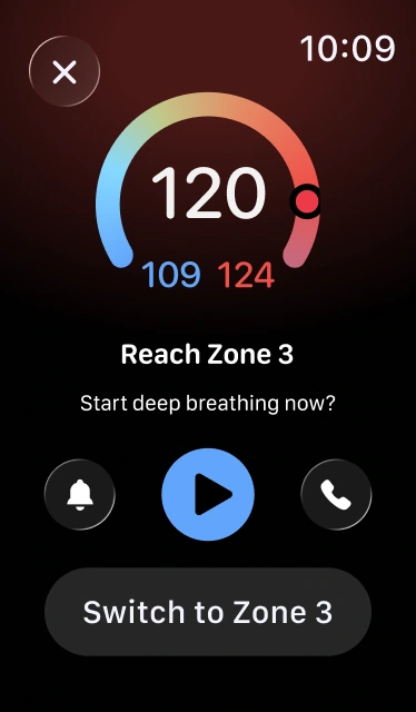
Trend Seeker
Options, not orders
Suggests deep breathing or switching to a higher target zone.
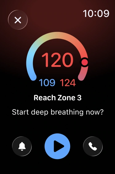
Health Manager
One direct instruction
Concise and functional: start deep breathing to get back in range.
Full jogging journey
Before, during and after the run for each user type
Hide details

Full jogging journey
Before, during and after the run for each user type
Hide details
Jogging journey comparison
Pain points → design response at every stage
Personalized jogging experience
One run, three experiences

User Type 1: Health Maintainer

User Type 2: Trend Seeker

User Type 3: Health Manager
Before jogging
1
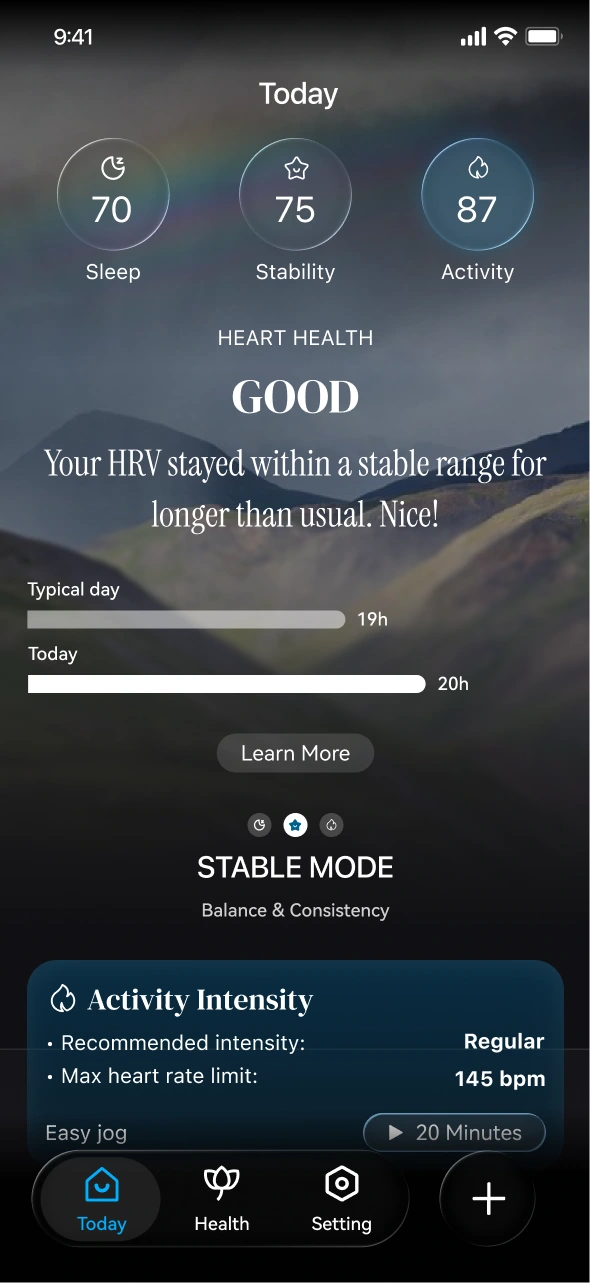
A simple HRV status.
2
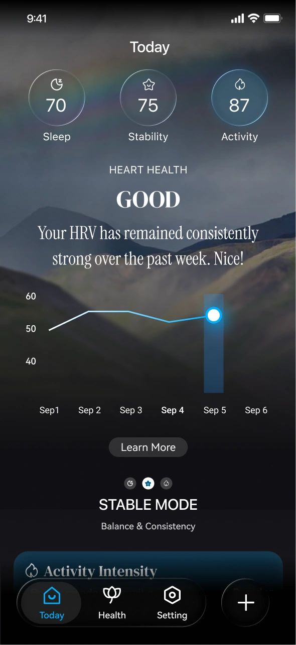
Trend line shows recovery recently.
3
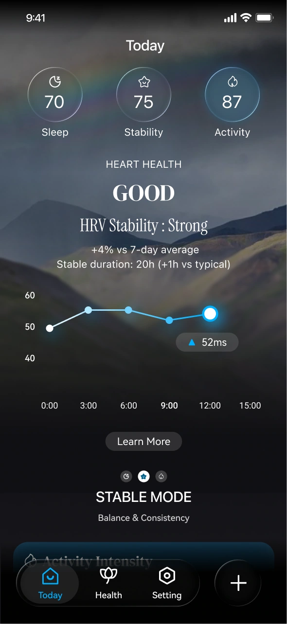
Including intraday variability.
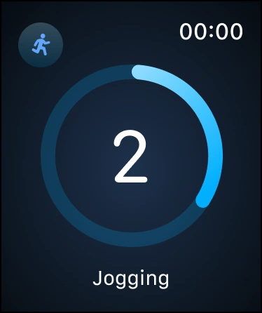
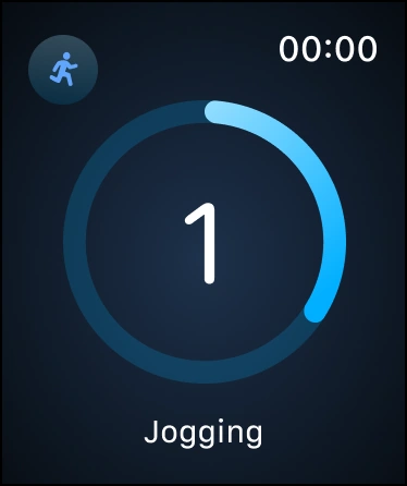
During jogging
4
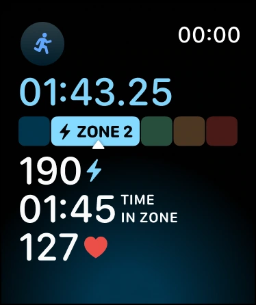
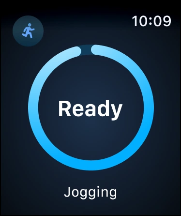
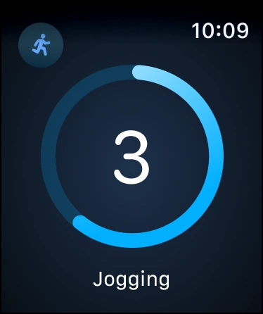
Standard running metrics.
5
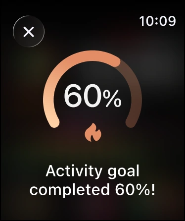
Activity progress.
6
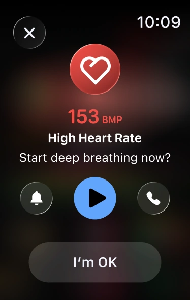
High heart-rate warning.
7
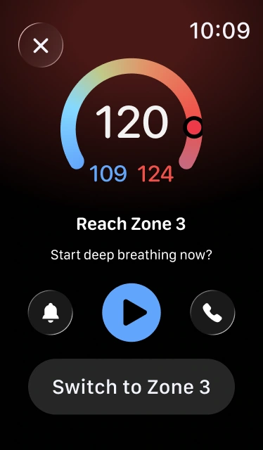
Suggests deep breathing or switching.
8
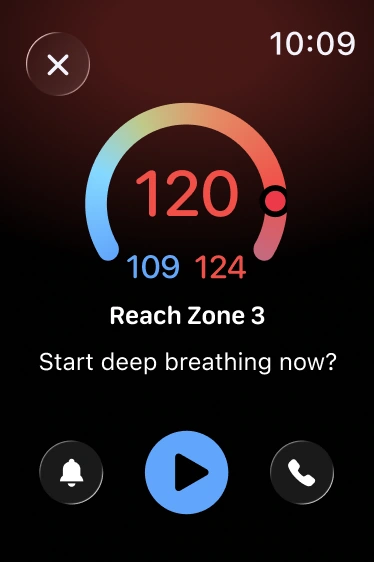
One direct instruction: breathe to get back in range.
After jogging
9
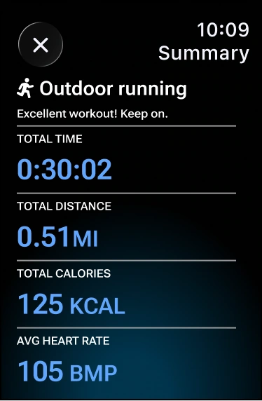
Just the overall session result.
10
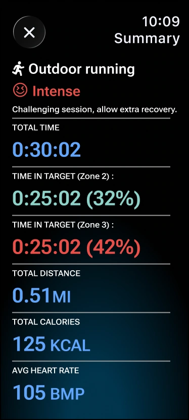
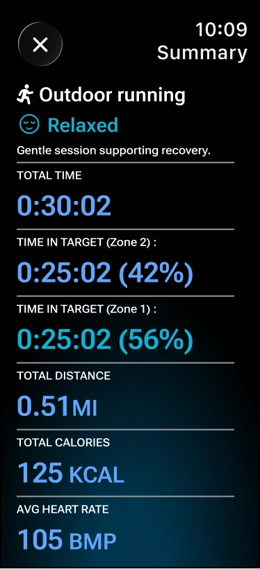
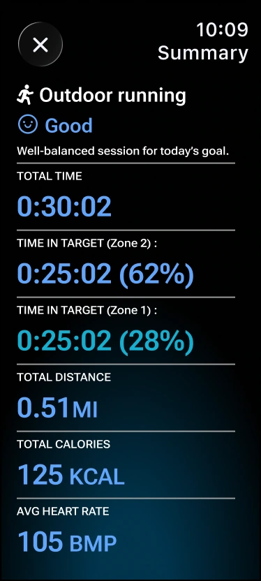
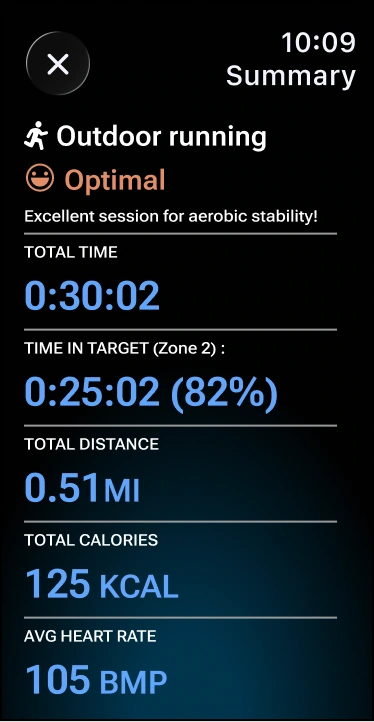
Rated Relax, Good, Optimal or Intense by time in zones.
11
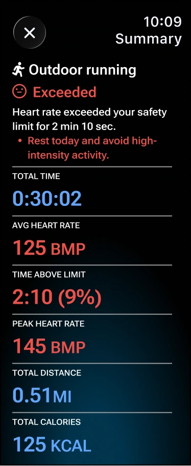
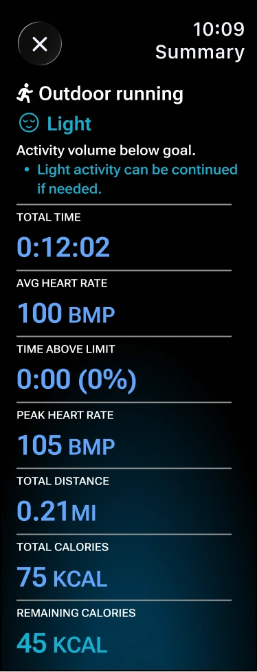
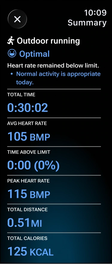
Rated Light, Optimal or Exceeded, with time over the limit.
12
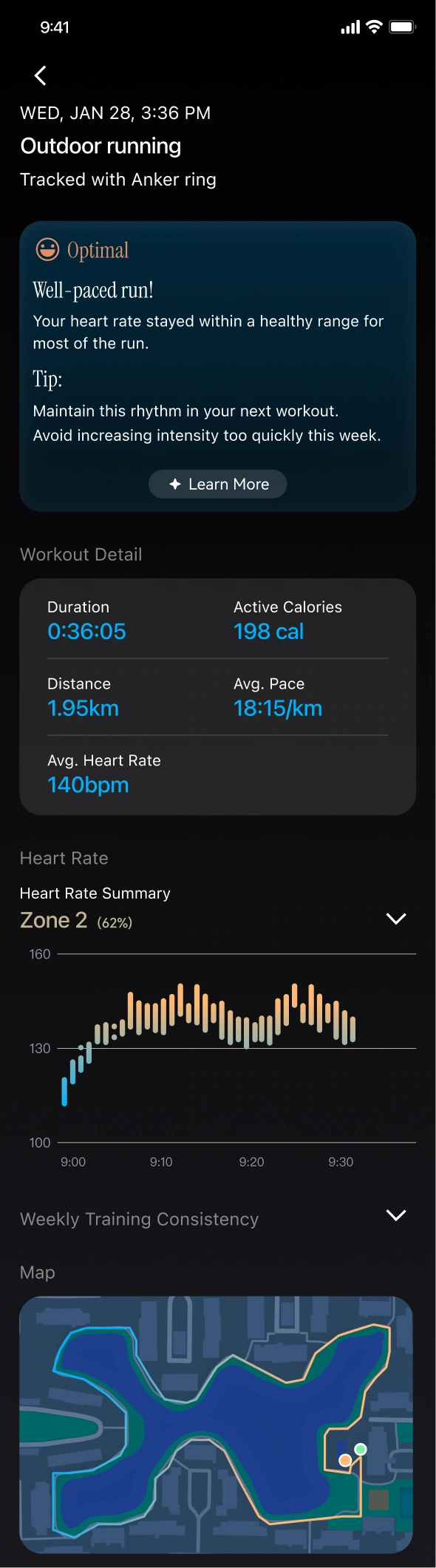
An overall assessment with personalized advice.
13
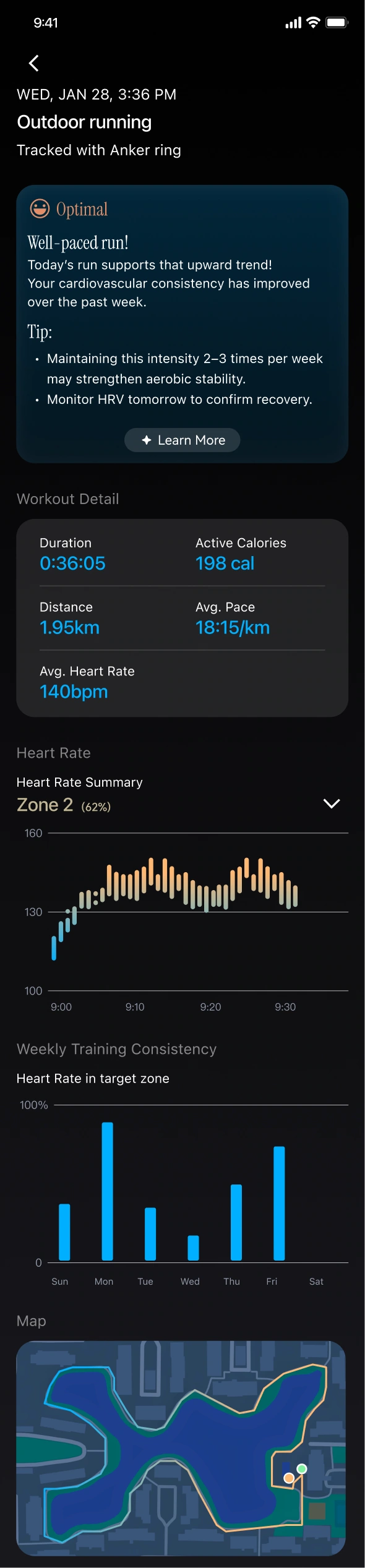
A weekly chart of time in the target zone.
14
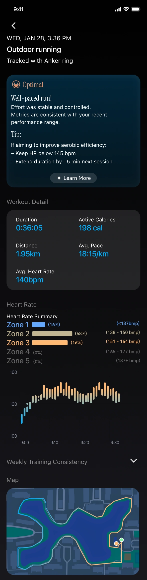
Full heart-rate zone distribution up front.
-Notification System-
Three tiers by urgency and attention cost
Quiet by default. Alerts escalate only when safety or device reliability is at stake.
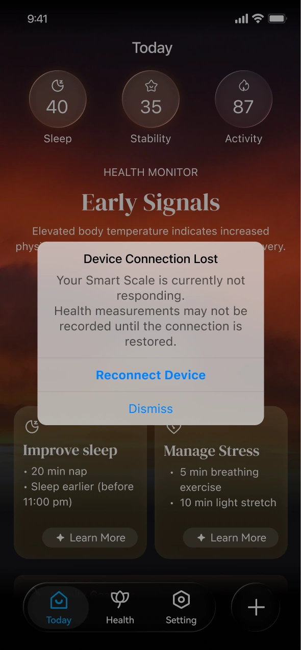
High
Critical alerts
Full-screen dialog; interrupts and needs acknowledgment.
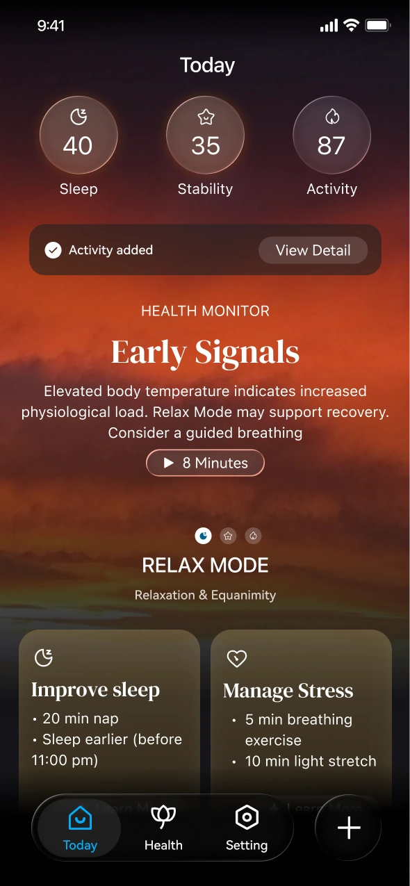
Mid
Contextual feedback
Inline card in the app; noticeable but non-blocking.
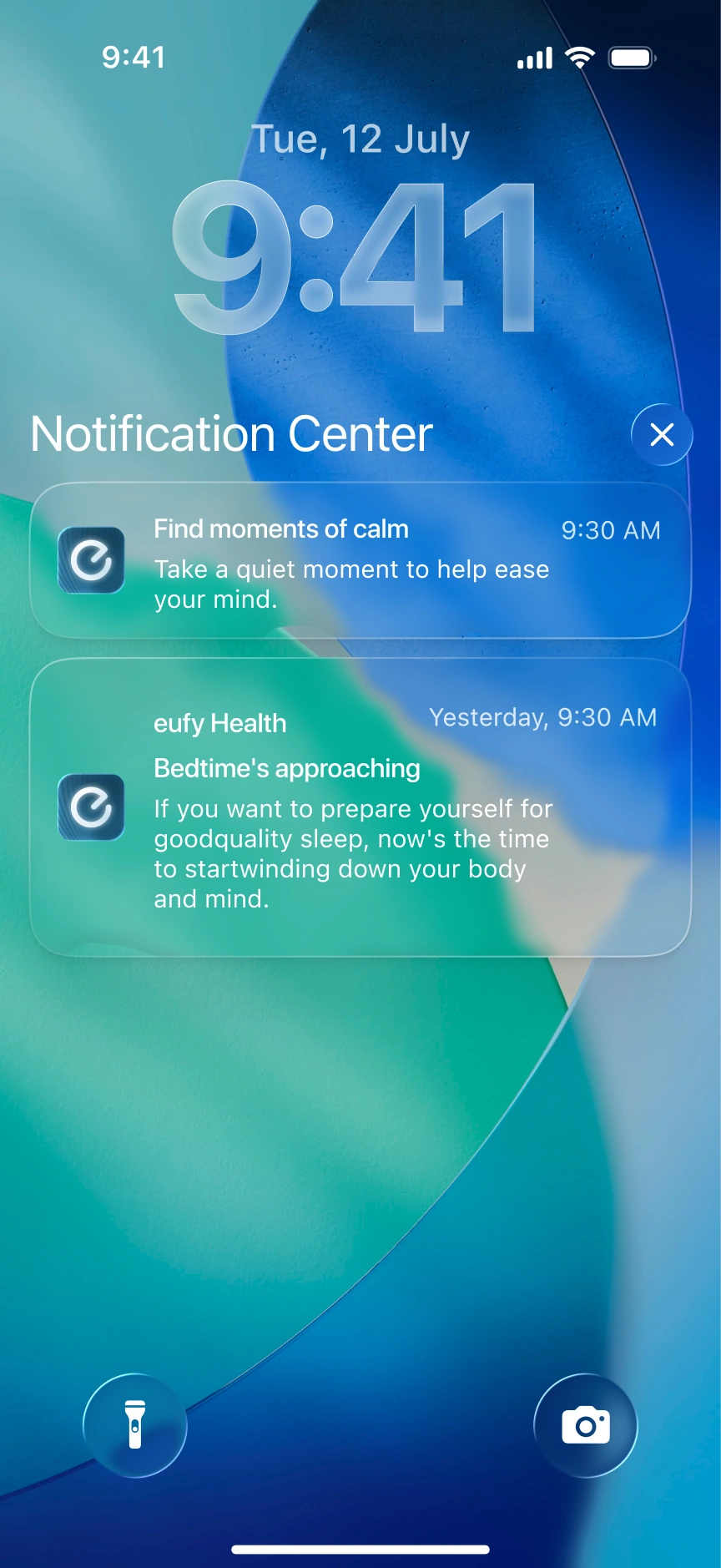
Low
Peripheral reminders
Standard push on the lock screen or notification center.
Alert details
Format, behavior, purpose and examples for each tier
Hide details

Alert details
Format, behavior, purpose and examples for each tier
Hide details
Module 3 · Health alerts
Three alert levels balance safety with a non-intrusive experience.
1. Critical Alerts (Interruptive Dialog)
Format: Full-screen or modal dialog
Behavior: Interrupts and needs acknowledgment
High
2. Contextual Feedback (In-App)
Format: Inline card or banner
Behavior: Non-blocking, needs acknowledgment
Mid
3. Peripheral Reminders (System Push)
Format: System push notification
Behavior: Light reminders outside the app
Low
Critical Alerts

• Abnormal heart rate
• Potential arrhythmia
• Extremely low HRV
• Device failure
Contextual Feedback

• Detected activity
• Signs of changes
• Device battery low
Peripheral Reminders
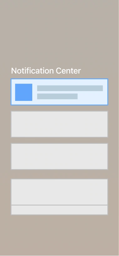
• Bedtime reminder
• Time to move reminder
• Battery fully charged
• Suggestion or summary
In product
How each tier looks on screen
Critical Alerts
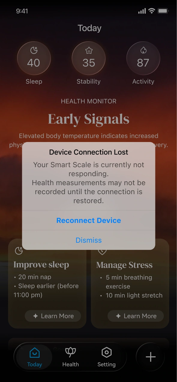
Purpose: Safety and device reliability
Contextual Feedback
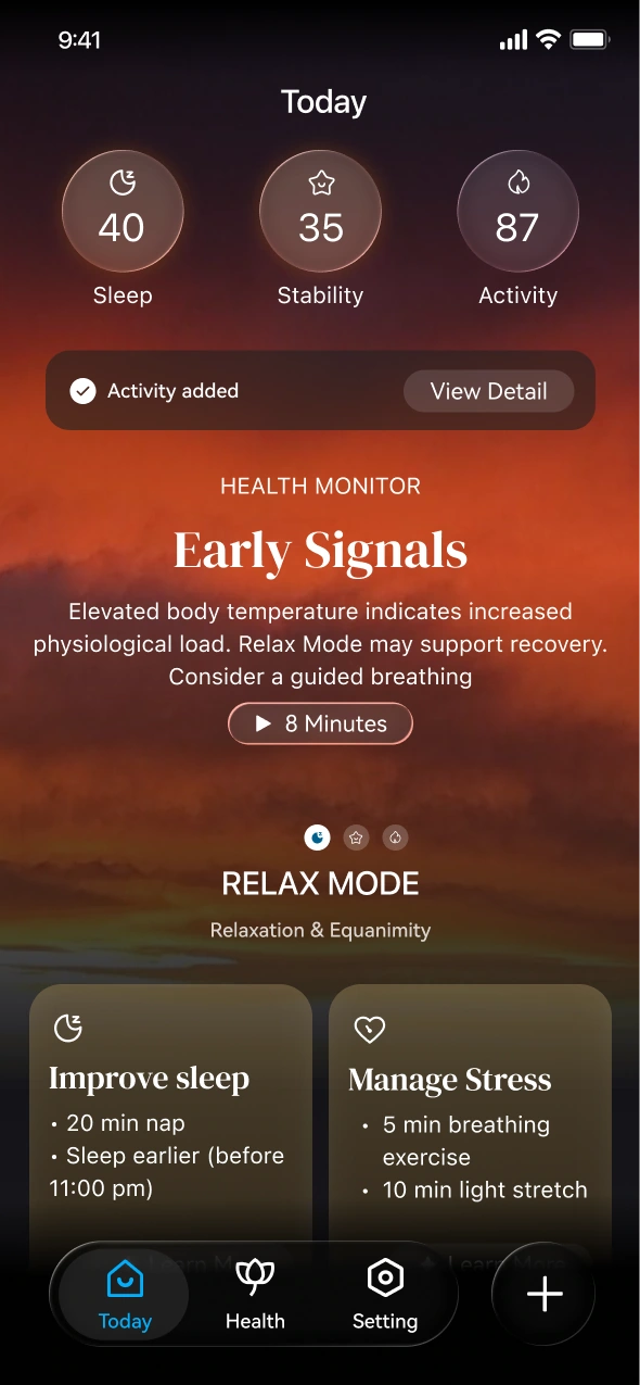
Purpose: Turn sensing into insights
Other format:
Confirm yesterday activity reminder:
Confirm Yesterday Activity:

Confirm today activity reminder:
Detected Activity:

Core Exercise
12min 11:30am

Confirm

Edit

Peripheral Reminders
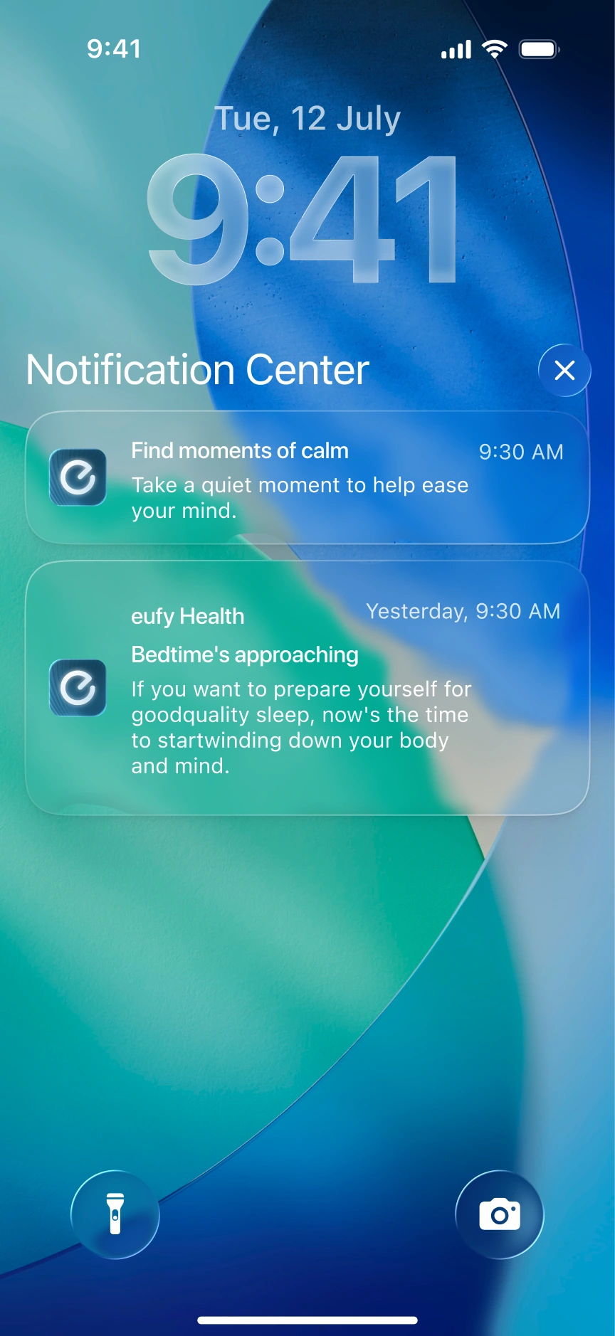
Purpose: Habits and device upkeep
End -
-

eufy Health
UX Design Intern, Anker · AI Health Coaching App
-My Role-
User Research / Information Architecture / User Flows / UX Framework / Visual Direction
-Project Goal-
Turn body data into clear, actionable guidance for health-aware adults aged 35–60
-Scope-
0→1 CONCEPT
80+ USER INTERVIEWS
800+ SURVEY RESPONSES
PHONE + WATCH